DAAC | Unreal | Isometric Shooter
DAAC is the temporary name for a long-standing project that has gone through several changes in terms of game engine and genre. Now, DAAC has settled into being an Isometric Shooter in the Unreal Engine. I started making devlogs about it for my friends, but to my suprise it gathered a considerable amount of views, and a fanbase started to build.
Since then I've continued to work on the game, creating devlogs periodically to keep the community up to date. I also started a Discord server in order to have a place where everyone can gather and recieve news. In each video I go through some of the suggestions from the viewers who commented on the last video. I explain why some ideas are good and why some are bad, and consider the work needed to implement the ones I like.
Developing DAAC has come with some challenges that are satisfying to overcome. Designing a game in an isometric perspective is pretty different from the more common first and third person. Having to consider what the player sees at all times and what they can't or shouldn't see is something that is prevelant in making the level layouts.
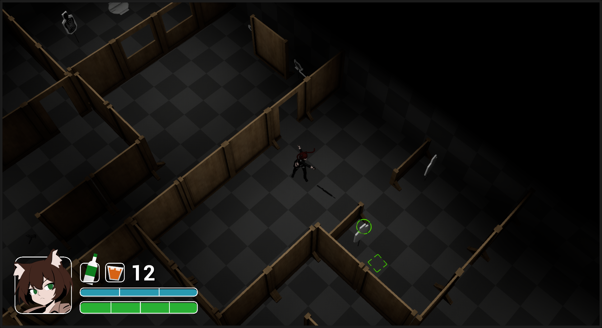
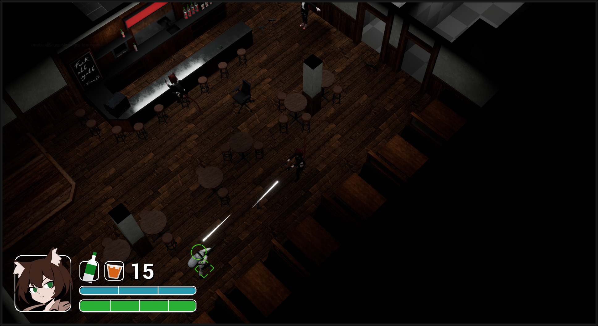
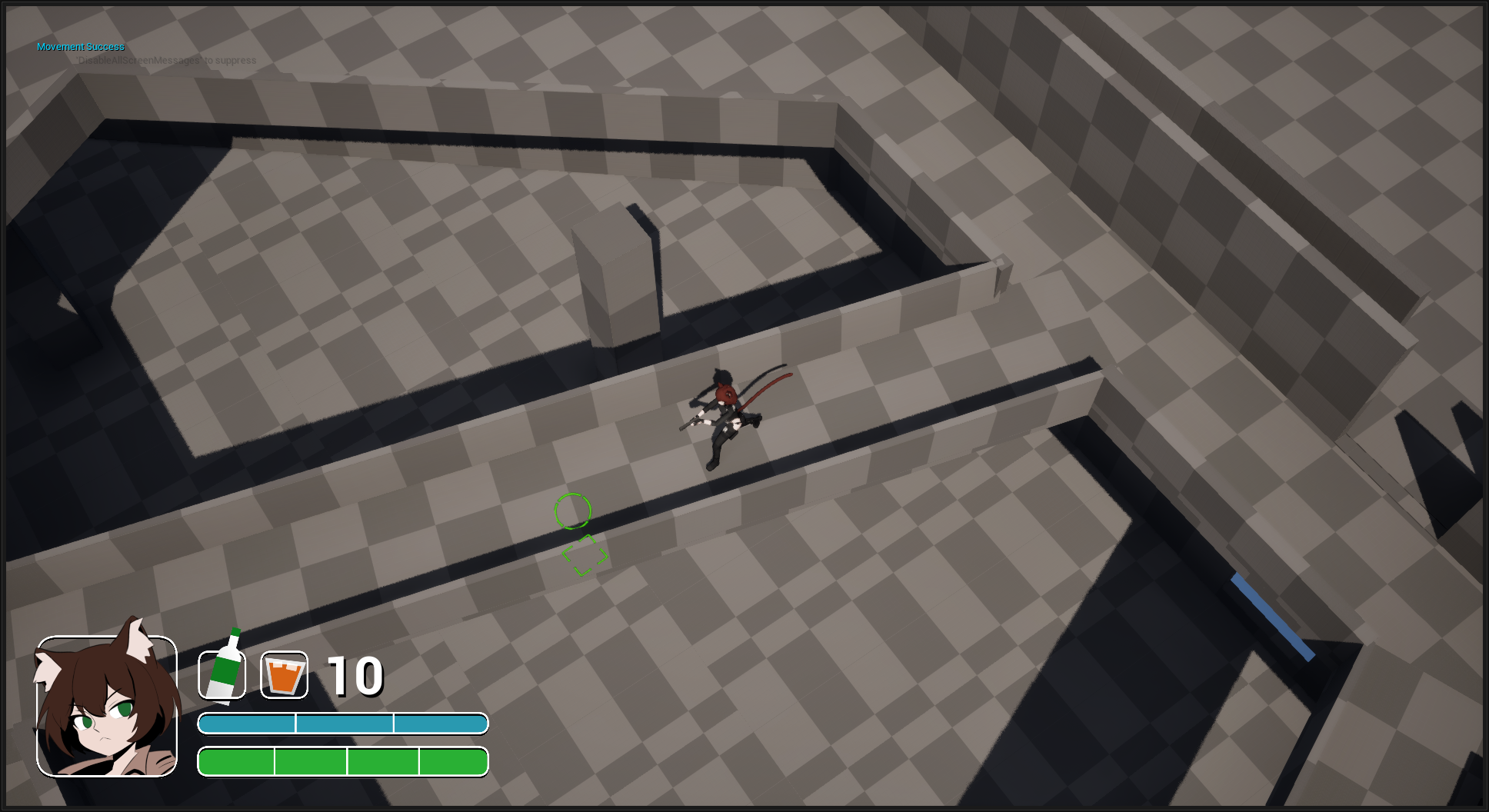
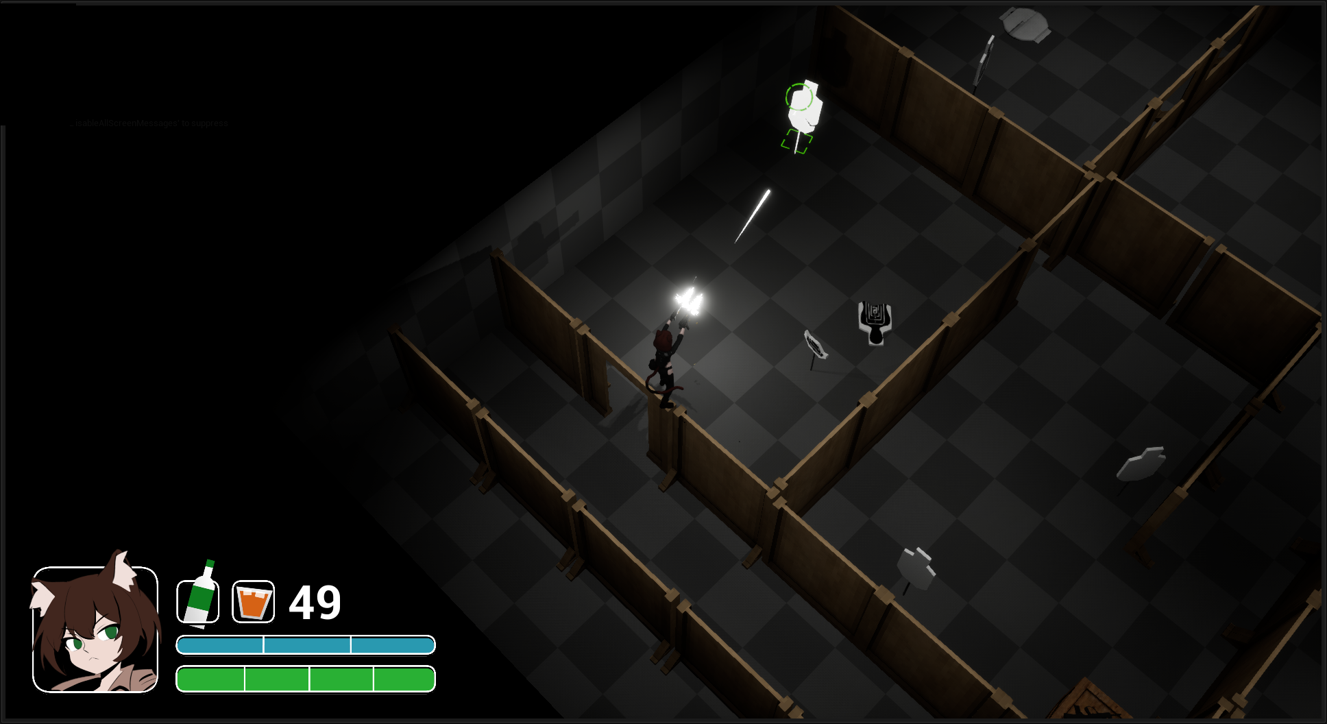
The biggest challenge so far has been designing the UI. I thought, since the camera is pulled back so much, that there would be plenty of screen real estate. It turns out that since the player can't directly control the camera compared to something like a first person game, it's vital the the UI doesn't block anything important such as enemies. One itteration of the UI was pre-rendered in Blender and imported as images to Unreal. It was too large, solid, and rather distracting. It didn't last long.
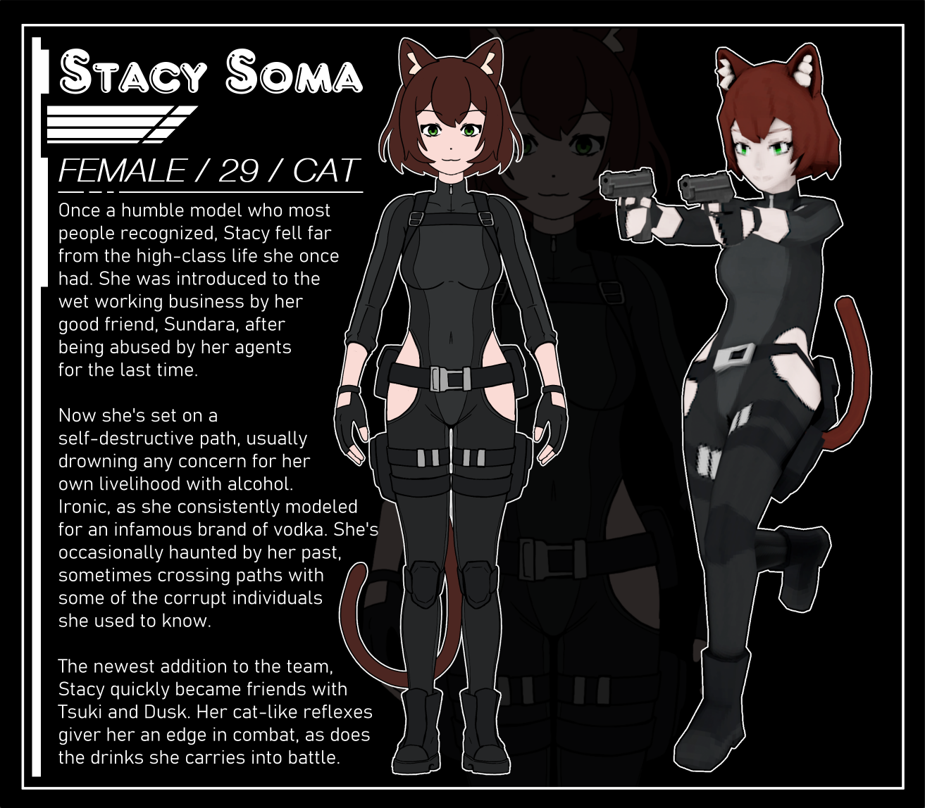
One condition I had for the UI was that it needed to have a spot for the character portrait. Dialogue during missions would have a textbox pop up alongside the portrait of the other character that was speaking, so I needed to make sure there was space for that too. At first I thought having the portrait be in the upper part of the screen would fit, but naturally the levels are laid out to where the player usually travels towards the top of the screen - rendering any UI element up there to be annoying.
Since this is still in development though, many of these things are subject to change. There are many other design philosphies I can't fit on this page that I cover in the devlogs. My goal is to release a demo that includes a mission and the "home base" area in the following few months.
Services
- Package Design
- Printing
- Branding
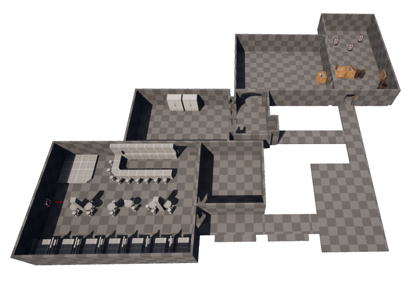
The (basically) first layout of the interior of Two Real
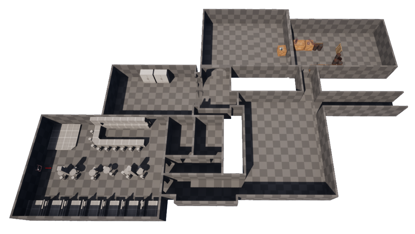
Updated layout, quicker to get between rooms
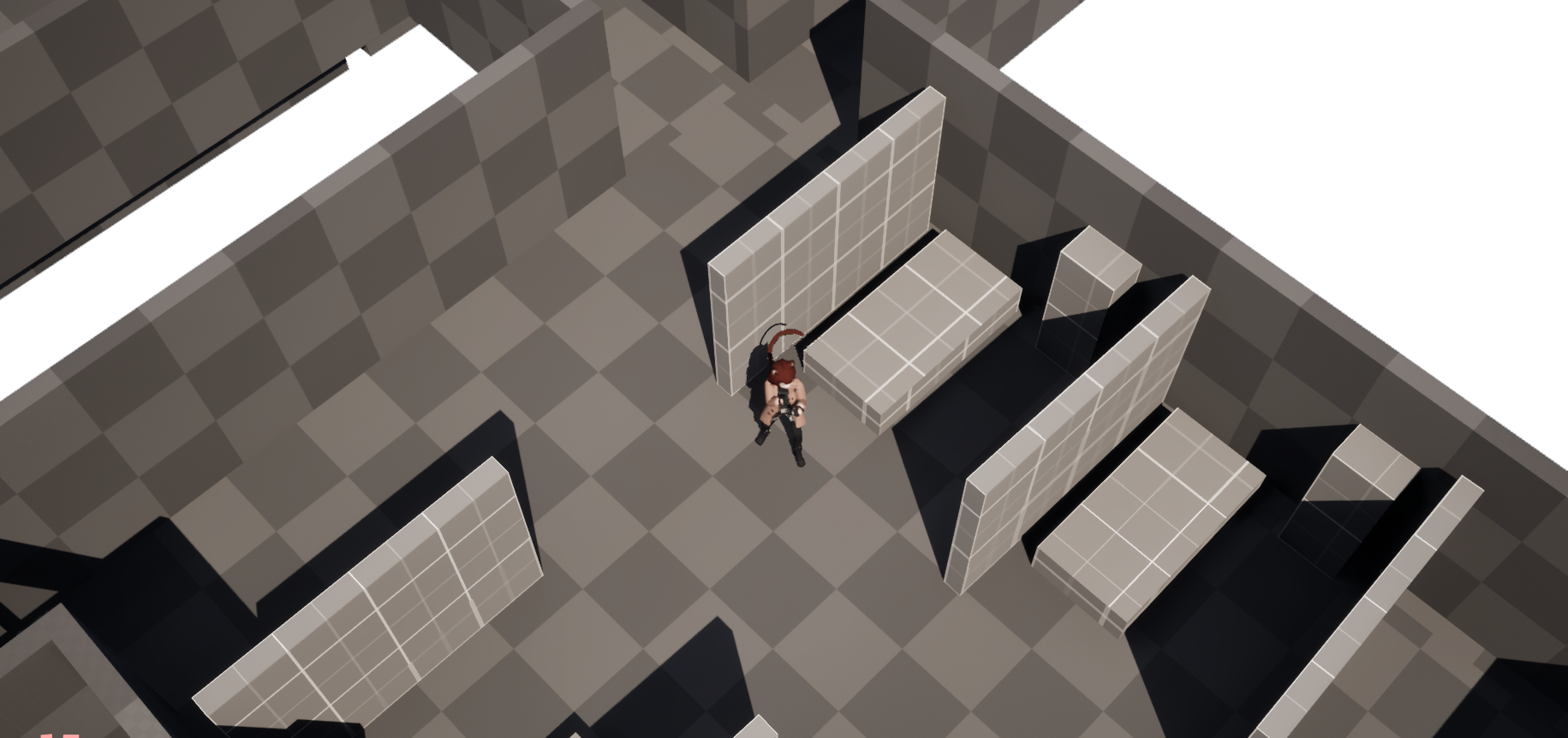
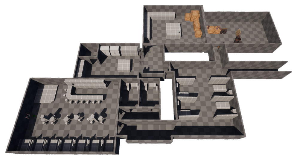
Fruniture blockout - though they ended up being too big, which in turn means the rooms are too big, all rooms besides the bar and kitchen need to be scaled down
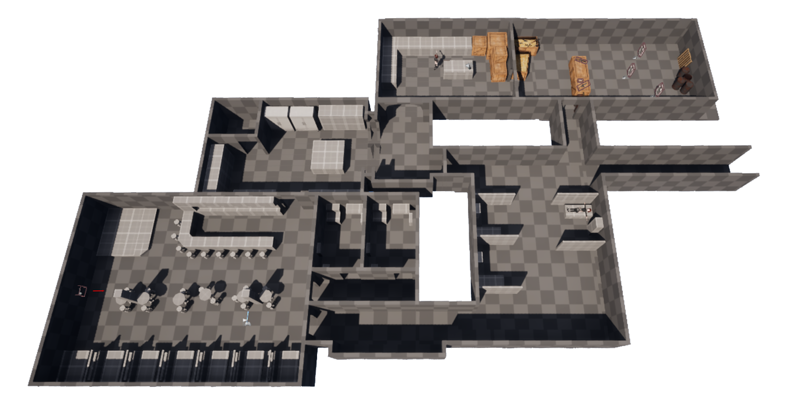
Rooms are now sized better, even quicker to get around. Normally, I'd try to incorporate verticallity into a map I'm designing, but since this is top-down, and doesn't allow to design spaces with multiple floors, I need to work within those contraints. So how do you make a space interesting without relying on concepts that can break up an area, such as verticallity? I figure relying on the placement of props and multiple rooms and hallways can make up for that loss.
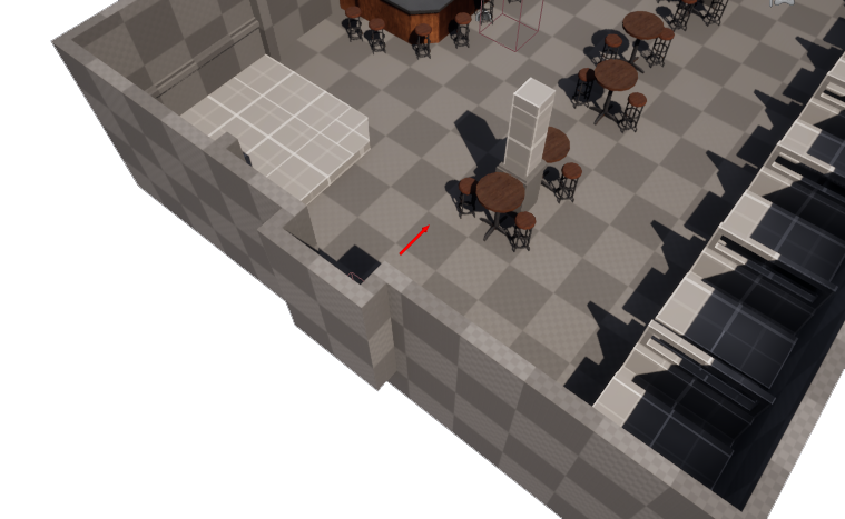
Making an outcropping for the door, or some kind of indicator that it's where it is is essential. Since the door is on the side of the wall that the player can't see, and they won't be able to see the sides of the walls that face out from the room, it's important to translate exactly where the exit is.
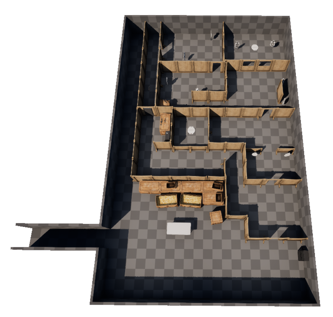
The killhouse acts as the tutorial:
1 - player learns the rolling mechanic to avoid turret fire
2 - player picks up a weapon, and is asked to destroy the turret
3 - player enteres the killhouse, getting a feel for the shooting
4 - the player is told they can throw their gun to deal damage
5 - player is given two one-handed weapons, introducing them to dual wielding
6 - player exits the killhouse, having quickly learnt the basic mechanics of the game
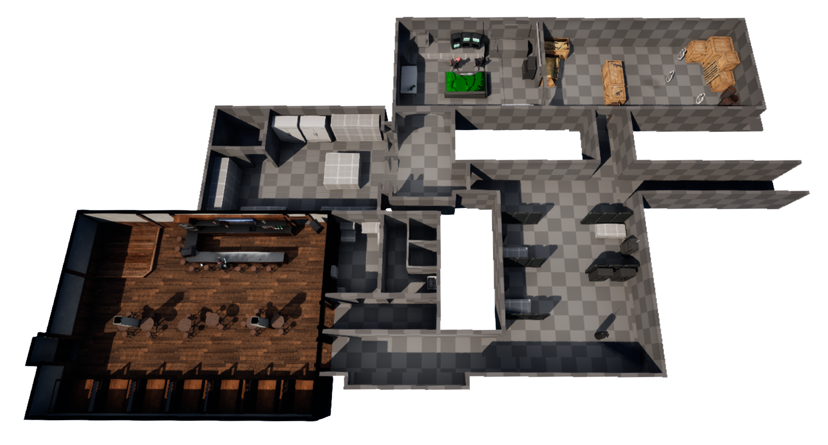
Integrating art and blocking out different layouts for each room to make them feel more unique.
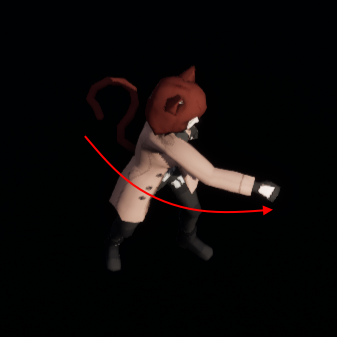
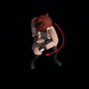
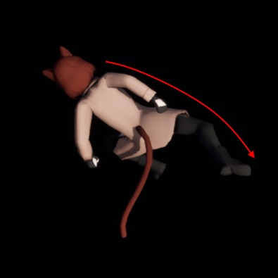
Stacy's unhanded combo has 3 moves, a jab, a cross, and a spin kick.
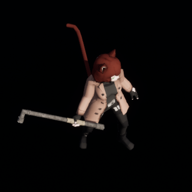
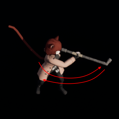
Melee weapons are used by swinging them back and forth continuously.
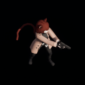
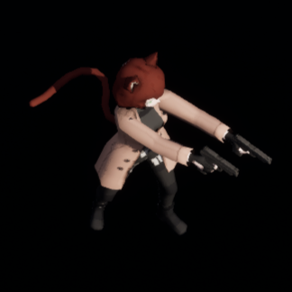
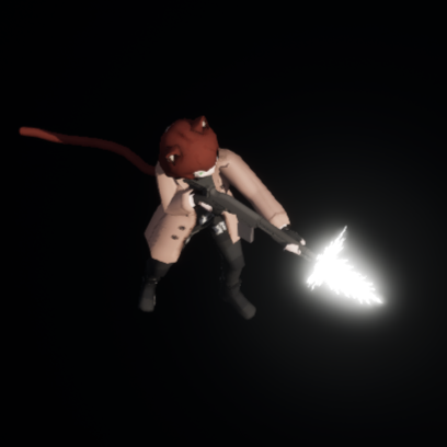
Guns are either one-handed or two-handed. One-handed guns can be held akimbo.
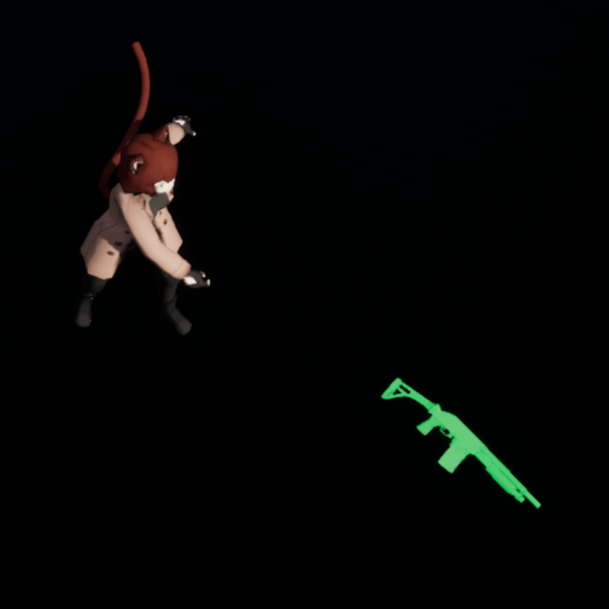
Guns are thrown when out of ammo, causing damage to enemies if they hit. They can also be thrown prematurely.
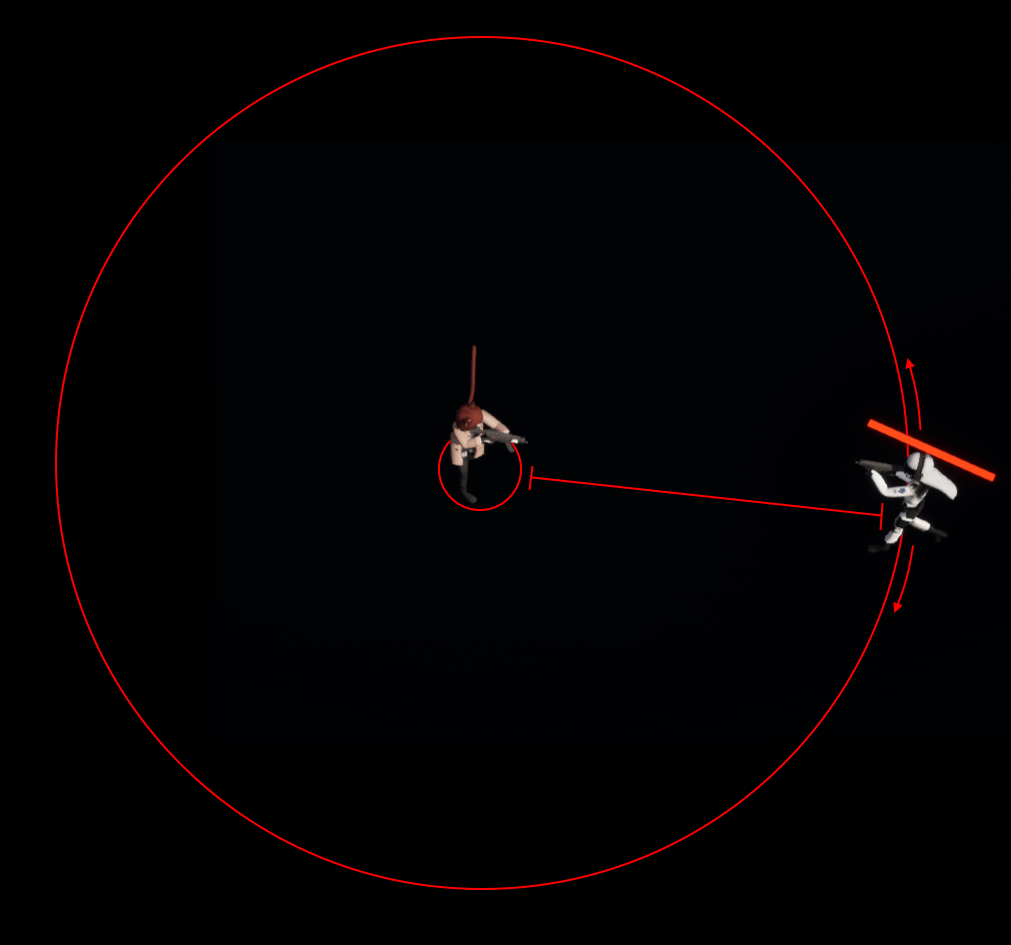
Ranged enemies will run to a set random distance from the player, then strafe around them while attacking.
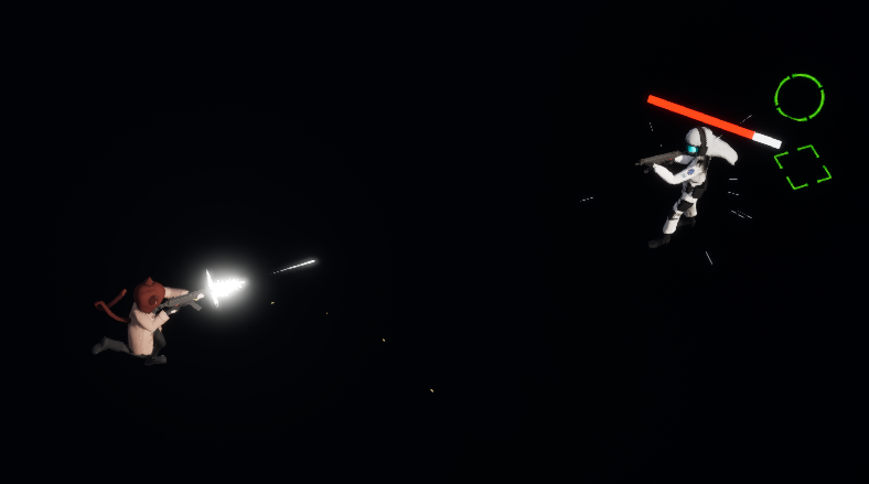
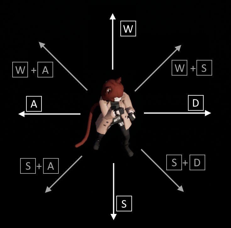
Since the camera is rotated 45 degrees on the Z axis, the player's movement would need to match that offset. Moving up isn't actually moving up in terms of the world's rotation, but rather matches the camera's. I wanted the movement to feel natural instantly, so this is also done in order to not confuse the player in any way. When they press D, the player moves towards the right of their screen, pressing A moves them to the left, and so on.
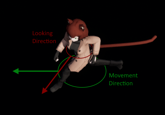
The animation blueprint blends the upper body with the lower body a lot. When the player moves, their upper torso will rotate towards their crosshair, and their lower body will rotate towards where they're walking.
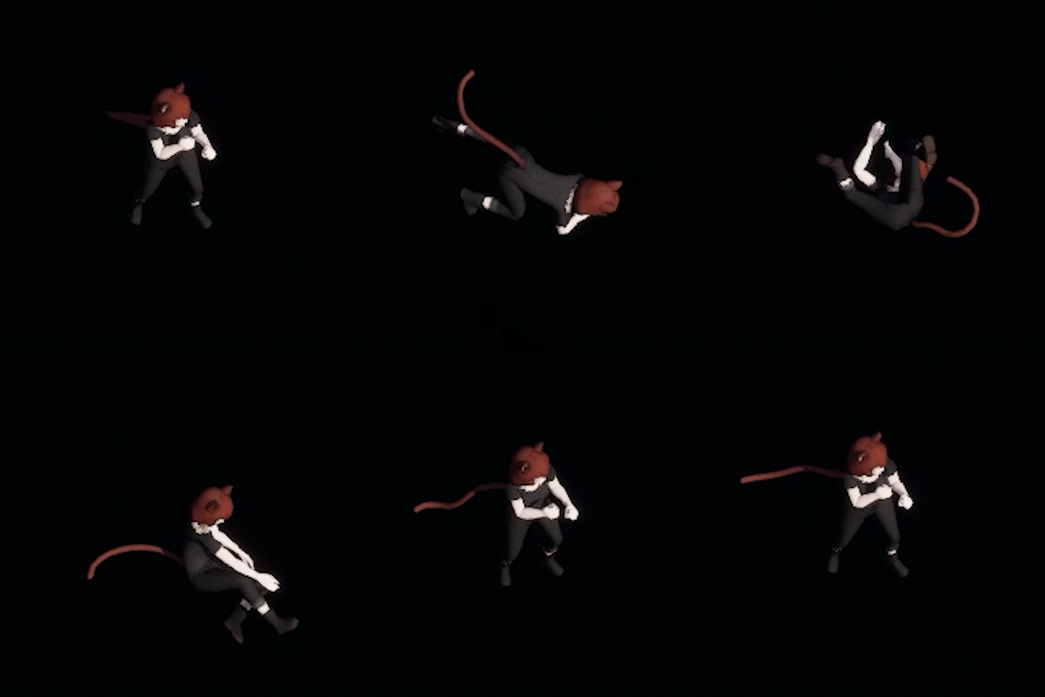
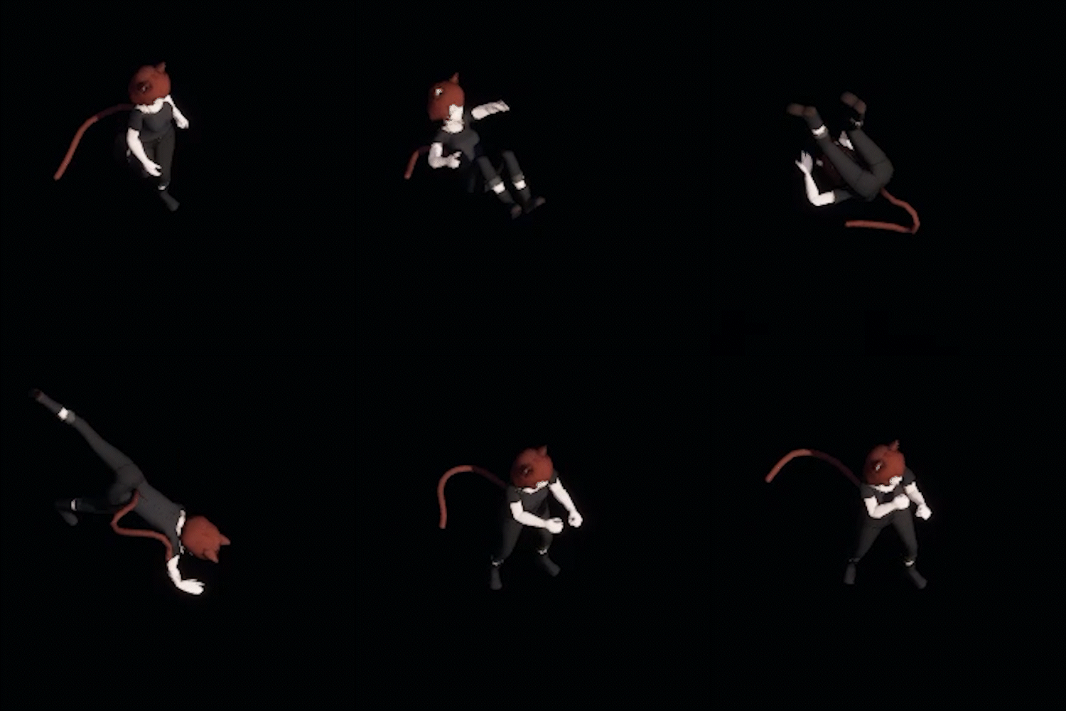
Stacy has 3 roll animations, one for rolling forward, backwards, and sideways. Her roll is based on what direction the player is moving in.
